So What Changed?
After weeks of coding and testing, we are excited to share the release of our updated app with you. We know how important it is to have your mobile event app feel like it’s your own. That’s why one of the main goals of our app’s revamp was to give our customers more freedom with the look and feel of the app. Read below for details one these updates:

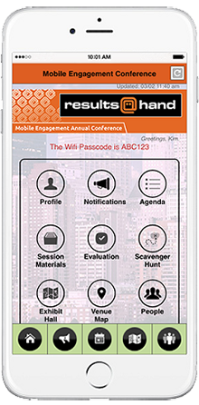
- Home Navigation: we now offer our home navigation in two different styles: list or icons. For those looking for a more classic mobile event app, we recommend our classic list of features. Those who want a more modern feel can select icons to represent the app’s features on the homescreen with the ability to reorder, rename, and replace.
- Background Image: in addition to our updated home navigation layout, our mobile event app now offers the option to have a background image. We have a few opaque options to select from but also allow customers to upload their own. This gives our clients the chance to incorporate their own branding themes through the entirety of the app.
- Banner Ads: with the growing number of devices per consumer, we know how necessary responsive design is. So instead of having one banner size for all screens, our header and footer ads will now adjust for mobile, tablet, and web screens.
Get the Demo Now
Our demo app allows users to get a hands on experience with our top mobile event app features, including customizing the Agenda, locating registered People, viewing the interactive Exhibit Hall, and responding to Audience Polls and Evaluations. With our latest look and feel updates in place, you can get a very true idea of our app’s functionality.
Visit our demo page to access our free app demos anytime. When there, click the icons on the left to download the app from the App Store/ Google Play or to visit it on your web browser. Prefer a tour of our apps? Just fill out the form to schedule a personal walk through of the app’s features and backend system.

